
We Partner with Contractors & Trades
Our business succeeds only when yours thrives.
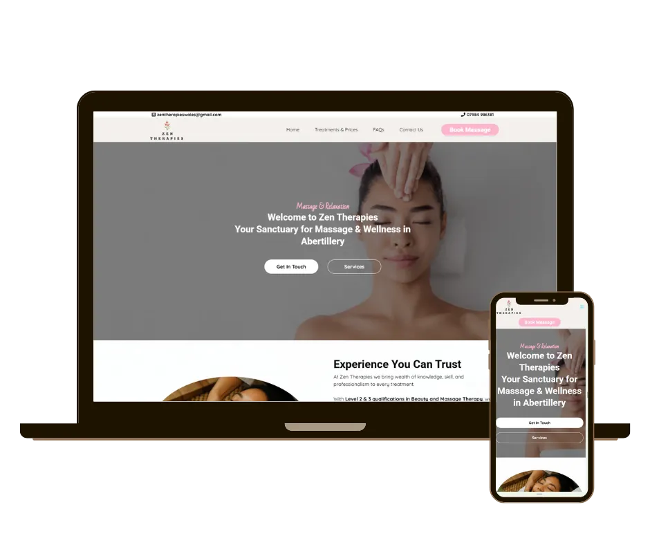
Trades trust us to transform their businesses with marketing systems, website design, reputation management, and automation.
Our Story
Our Mission: Helping UK Businesses Scale Online
At Time To Scale, our mission is simple: empower ambitious businesses to grow online through smart, results-driven digital strategies. Based in Newport, South Wales, we partner with clients across the UK to deliver websites that don’t just look great—they rank, convert, and scale with your business.
Who We Are: A Team of Creators, Coders & Strategists
We're more than just a web design and SEO agency. We’re a passionate team of designers, developers, SEO specialists, and automation experts who care about your results. Every project is built on collaboration, transparency, and a shared drive to see your business succeed.
Our Approach: Data‑Driven Design Meets Strategic SEO.
Everything we do is grounded in performance. From fully bespoke websites to targeted SEO campaigns, our work is shaped by data, not guesswork. Your site will be fast, mobile-ready, and SEO‑friendly from the ground up—engineered to turn visitors into leads and leads into loyal customers.
We don’t offer cookie-cutter packages. We build custom strategies that align with your goals, budget, and audience—always with ROI in mind.
Our Core Services
SEO Services – Local, technical, and content-focused strategies to improve visibility and bring in quality traffic.
Bespoke Web Design – Custom websites optimised for performance, UX, and search engines.
Booking & Calendar Systems – Streamlined, branded booking systems that save time and increase customer satisfaction.
Review & Reputation Management – Tools to automate 5-star review collection, monitor feedback, and build trust online.
AI & Smart Integrations – From chatbots to CRMs, we streamline your workflow for scalable growth.
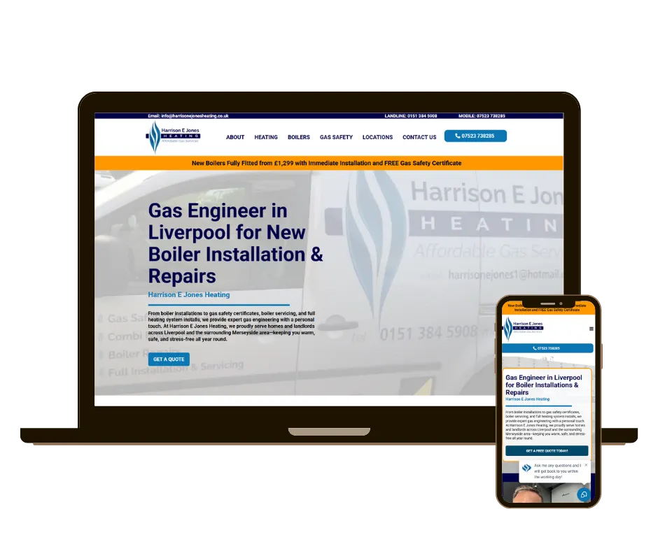
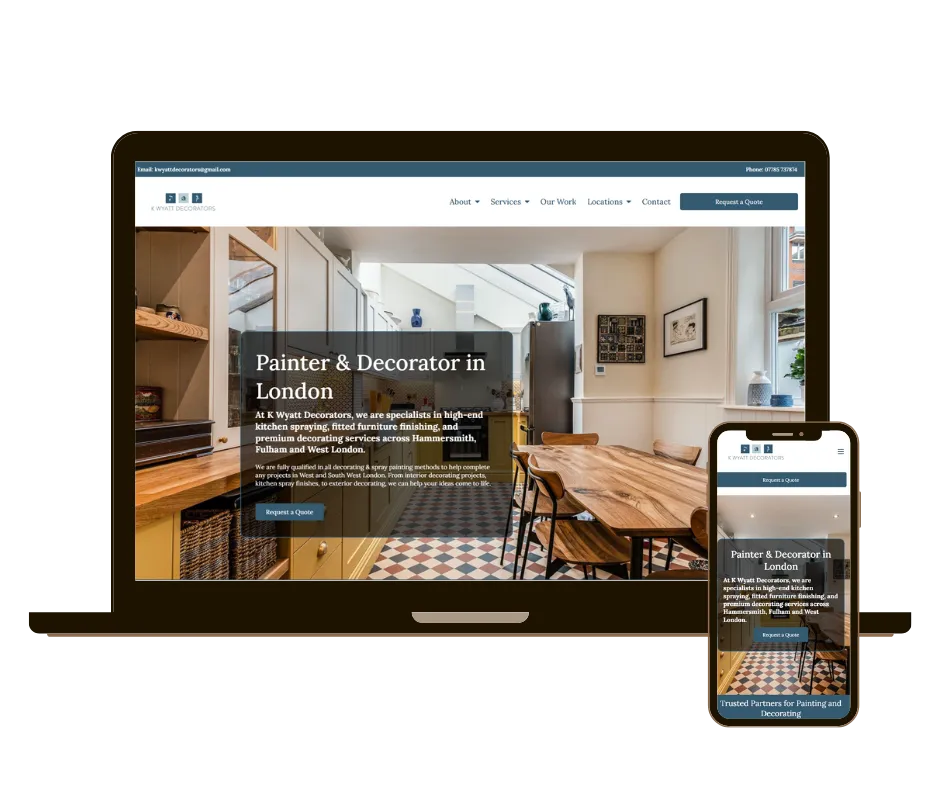
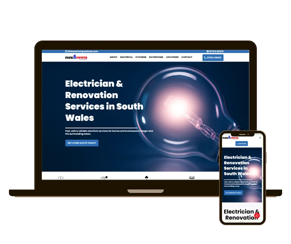
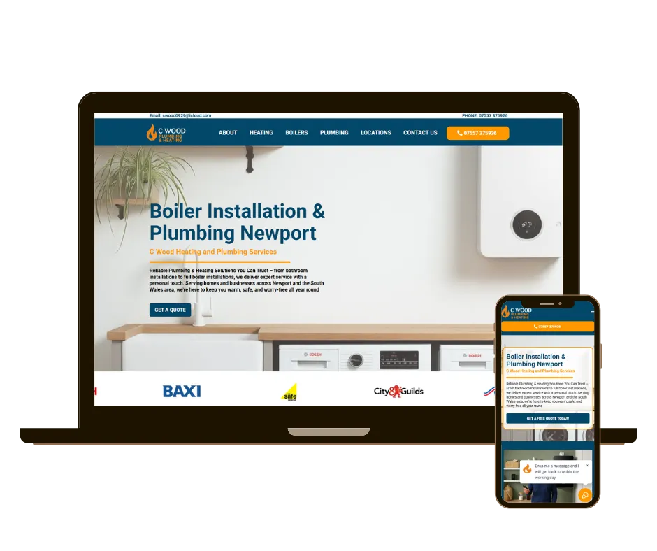
Success Stories: Real Results from Real Clients
We’ve helped businesses across industries—from startups to established brands—achieve measurable digital growth. Whether it’s doubling organic traffic, launching a site that ranks within weeks, or automating workflows that save hours each week, our clients see the impact of what we do.
Success Stories: Real Results from Real Clients
Newport is where we started, and it continues to shape who we are—grounded, resourceful, and growth-focused. While we work with clients across the UK, we’re proud to serve local businesses in South Wales and help build a stronger digital economy here at home.
Join Us: Let’s Grow Your Business Together
Time To Scale isn’t just a service provider—we’re your growth partner. Whether you're launching a new business or scaling an established one, we’re here to turn your digital goals into real-world results.
Let’s chat. Book a free strategy call and see how we can help your business scale online.
We are precise in business and purposeful in every aspect of our culture.

Transparent & Passionate
We genuinely care about our partners and our work. We are committed to your success.

Integrity
Maintain standards that reflect only the best for your business & our own.

Partnership
Your not a client, we are partners. Our business model relies on a partnership. We only succeed when you do.

Adaptive
An individualised approach means understanding your niche and working together to achieve the best results. Markets change, let us help your business adapt with the times.
Discover
Company
Follow Us
© 2025 Marketing Agency. All rights reserved. • Time to Scale